I love color – it is the easiest way to instantly upgrade any space! Of course white rooms have merit as well but I have found that color on the walls make any space more interesting. If I can convince a white-loving client to take on a bit of color it always turns out to be a win!
I have a particularly tender spot in my heart for dark hues. If you have a room that does not have any natural light, going dark creates a dramatic atmosphere that is hard to beat. It also really makes artwork and bold patterns pop! That is why a lot of museums here in Vienna have started painting their walls in dark, vivid colors – depending on their exhibitions (go check out the Albertina or the Mumok to see the effect live). I think dark colors are great for bedrooms as this can create a particularly cozy atmosphere and I find that a bit of drama is healthy in a bedroom….
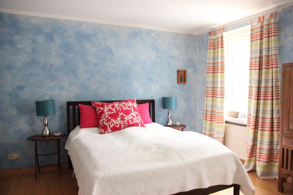
So I would like to share a before and after of a North-West facing bedroom that was transformed into an eclectic, luxurious boudoir with the help of a pot of paint, some fabric and a few strategic furniture upgrades. Here is the bedroom before the transformation:
The walls were painted in a sky blue with a cloud effect, there was an embroidered pillow from Mexico and striped curtains that repeated the colors present on the walls, in the pillows and the lampshades. The client was no longer happy with the curtains and the proportion of the lamps and requested a nightstand with storage space as well as a work place. They also wanted an upholstered headboard but did not want to invest in a new bed just yet and were happy with going with a darker color on the walls.
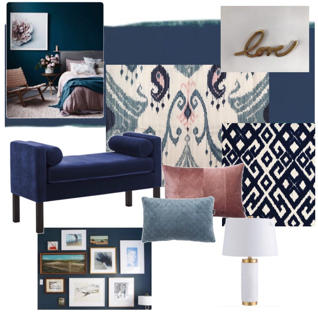
The starting point for the design was a fabric from M.Faber & Co (a Vienna-based, awesome fabric store that I absolutely, absolutely love and that I cannot recommend enough – check them out here) that had a white background and a dark blue, light blue and dusky pink pattern on it. Based on this I came up with this mood board:
The paint pictured on the mood board is called Augarten – a magnificent, highly pigmented color by a Viennese company called Galerie So (they have a range of beautiful colors with the most awesome Viennese names). I planned using the main fabric for curtains and taking the colors from the curtains for the soft furnishings. Velvet is a beautiful material to use in a bedroom and I planned for the accent pillows to be in structured velvet as well as in the embroidered dark blue fabric you see on the mood board. To tie it all together I planned for gold to be used in the accessories to add some extra sparkle.
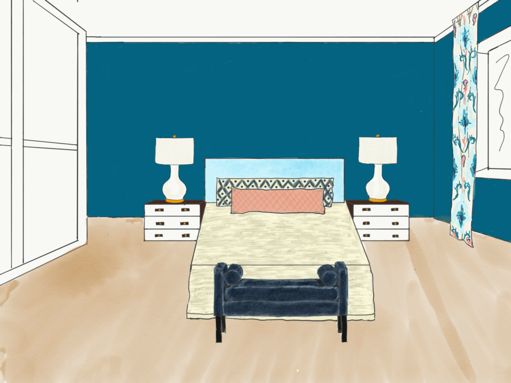
Apart from a 3D floorplan I did two renderings of the room – one view of the bed and one view of the gallery wall opposite the bed. This gives you a better idea of what the room will look like once all the elements come together:
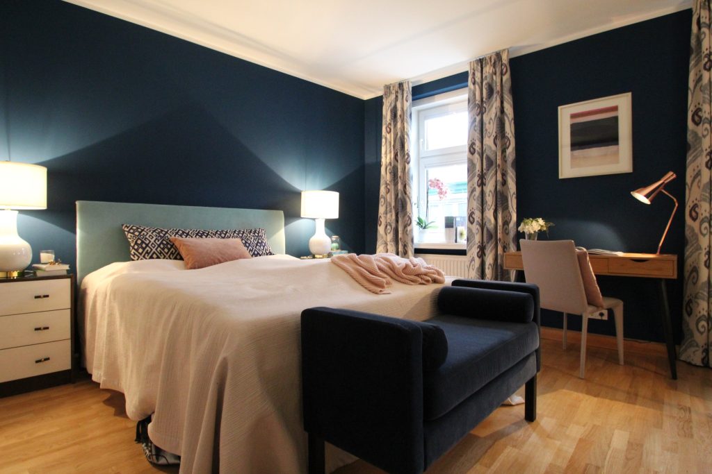
It always takes a few weeks (or months, depending on the client) for a project to be completed but the end result is always worth it! This is the space after the transformation:
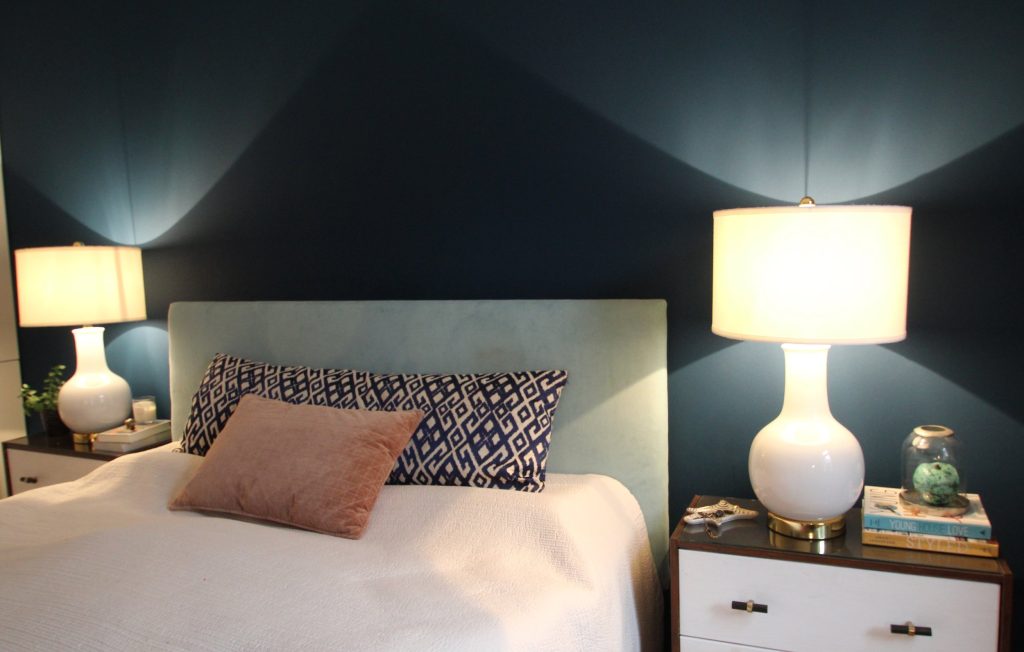
I put in new curtains made from the inspiration fabric lined with blackout lining to ensure a good nights sleep. I also took the colors in the curtains as inspiration for the other soft furnishings. We upholstered the headboard in a light blue velvet and we brought in a bigger bedspread (from Zara Home) that was better suited for the size of the bed.
The wooden headboard was upholstered in blue velvet and different kinds of pillows were added to add layers and texture. The long pillow on the bed was custom made from beautiful embroidered fabric I found at M.Faber & Co and the other accent pillows were ordered from Westwing Now. I used structured velvet in the accent pillows and the bench at the foot of the bed to give the bedroom a luxurious feel.
I put some new, taller lamps on the nightstands that were better suited to the proportion of the bed. The nightstands are a hack of Ikea Rast. Ikea Rast is everybodys favorite piece of Ikea furniture to hack as it is made of wood (not wood laminate), offers a lot of storage and can be easily upgraded with some paint and hardware. Which is exactly what I did here – the corpus of the nightstand was stained in Walnut and the fronts of the drawers were painted white. The nightstand was finished with a top of safety glass to prevent staining and ensure light reflection from the lamps. Some new hardware from Anthropology was the final touch needed for an elegant look (I love upgrading furniture with new hardware – check out my post on this here).
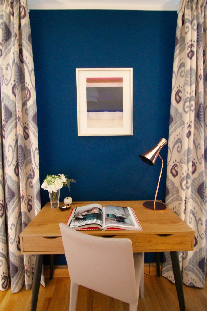
A small work space was created by placing an oak desk between the two windows with some elegant lighting. I also found this piece of art on minted that suited this space perfectly!
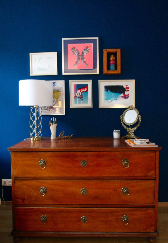
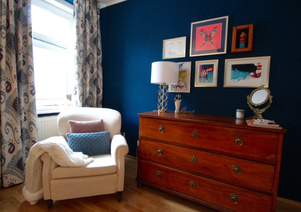
There was some great art, so I decided to create a gallery wall above the antique dresser opposite the bed. I added some limited art prints ordered from minted that also have pinks and blues to give a coherent look. The gallery wall is designed so that it can be expanded with further art in the future.
Gold looks great against dark blue so gold accents were used throughout the room with new objects such as the lamp and the “love” sign (it is from Westelm and I love it) and old objects such as the decorative Jugendstil mirror that I found for 80 Euros in a tiny antiques store in Carinthia.
I loved doing this project as the upgrades were simple and straigt forward and the result is stunning: